Understanding the CSS box model is essential for web designers looking to be precise in the size and spacing of elements. This is important because it dictates not only how we design but also directly impacts the user’s experience as well.
In Addition, when combined with effective layout techniques and responsive design, knowing your box model will enable you to create visually pleasing websites that are functional and accessible from any device.
Let’s dive to transform your web design skills!
Understanding the CSS Box Model
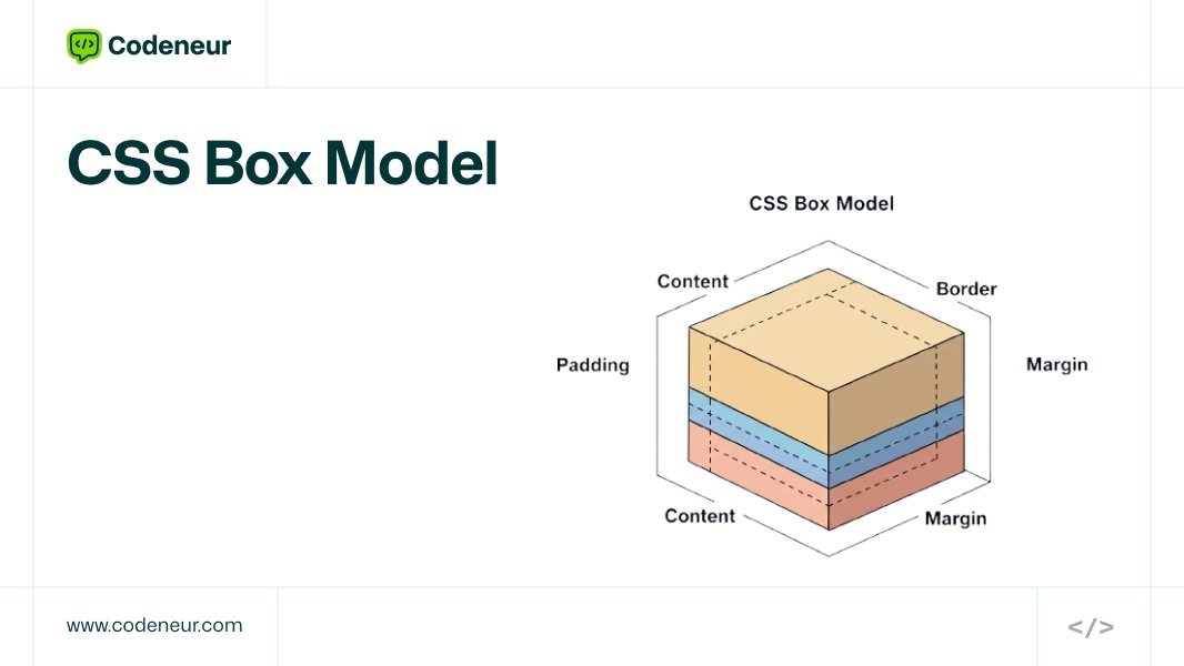
What is the CSS Box Model?
The CSS Box Model is an important concept explaining how the structural and visual aspects of elements in a web page work. It forms a basis for good design because it dictates how space is assigned around an element, which affects layout and overall design.
Importance of CSS Box
The CSS Box Model simply describes the rectangular boxes any web content takes up on a page. It is vital to appreciate this model because its direct impact goes so far as determining how information is displayed and used in return. A sound understanding of the box model will guarantee the designer delivers aesthetically pleasing, usable designs.
Four Key Components of the CSS Box Model

Content Area
This is the innermost area where texts, images, and other forms of media live. One can set the size of a content area using properties like width and height.
The content area is the actual core of the CSS Box Model. Every important thing is in this area.
How to Set and Style the Content Area
- Use attributes, such as the width, height, min-width, and min-height, to set up the content area.
- Styling typically includes background colors, fonts, and many more to achieve a better look.
Types of Content
- Text: Change the font size, weight, and even line height to achieve readable text.
- Images: Responsive dimensions using properties like max-width: 100%; so that the images should scale well
- Videos: Choose the proper width and height so that the aspect ratio is preserved
Padding: Creating Inner Space
The space between the content and the border is called padding. This makes space for breathing around the content, hence creating a perfectly aesthetically pleasing effect. By properties like padding-top, padding-right, padding-bottom, and padding-left you can control padding.
- The padding adds much-needed inner space around the content, that enhances the layout as well as readability.
- Proper padding prevents text and other content from being too compact and makes things more readable in general. It lets the eye of the user be led and gives a better aesthetic look.
- Buttons: Adequate padding makes buttons more clickable and attractive.
- Cards: Adding padding inside card layouts enhances separation of content so it is easier to digest.
Borders: Adding Visual Structure
The padding and the content are wrapped up by the Border. It can be assigned with several widths, colors, and styles (such as solid, dashed, etc.). Borders can even add more visual structure to elements.
Borders can frame your elements and add visual structure to your design.
Variations of Border Styles and Their Impact
The borders can be only a line or maybe dashed, dotted, or even double line. The type of Border style may largely impact the final look of an element.
Border-Related Creative Implementations
- Hover Effects: Style borders on hover over a class to give interactive feedback.
- Highlighting Sections: Use a thick border or a border of color to highlight important sections.
Margin: Managing Outer Space
Margin is the outermost spacing surrounding the element which separates the element from the other elements. Besides controlling how elements are positioned in relationship to each other, margins allow you to control the positioning of elements on the page. As with padding, margins can be individually specified for each side.
Understanding these four components helps designers have the best level of control over element spacing and layout so that the UI will be clean and friendly.
The space outside of an element is called margins, which also help in differentiating one element from the adjacent elements.
How Margins Create Space Between Elements
Margins prevent elements from colliding with each other by ensuring there is enough space, resulting in a clean layout.
Methods for Uniform Usage of Margins
- Uniform Values: Consistent margins among like elements ensure uniformity, so using consistent values for the margin is recommended for a uniform outlook.
- Responsive Adjustments: Use media queries to adjust margins for different screen sizes, ensuring your layout remains balanced across devices.
- Knowing the elements of the box model adds some significant pieces to your web design competence. It makes layouts not only aesthetically pleasing but also user-friendly.
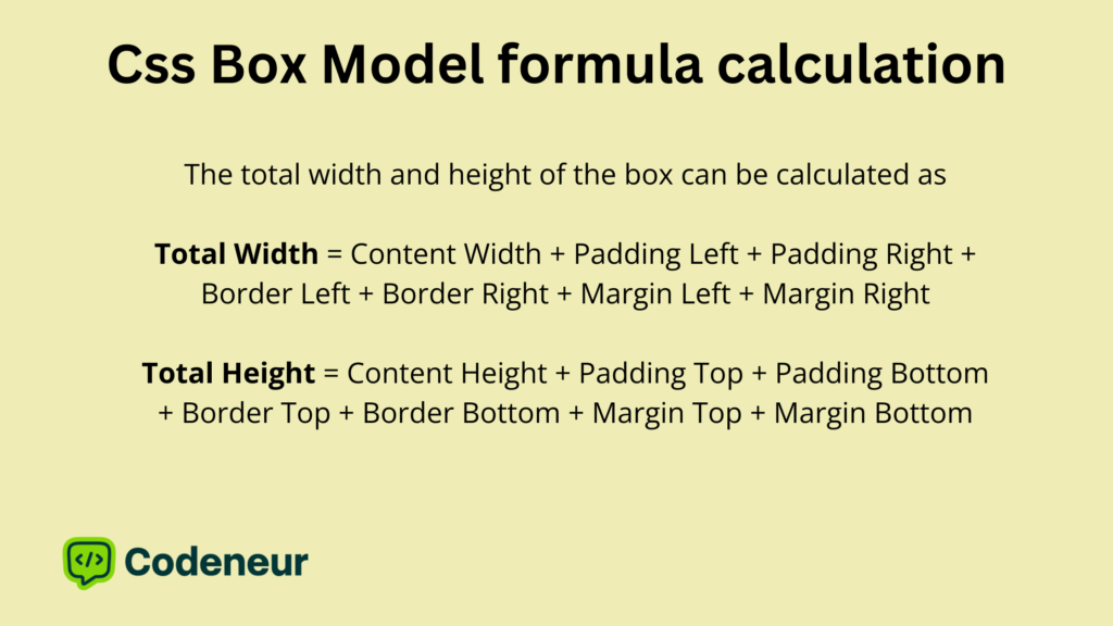
Formula Calculation
Calculation Steps
- Content Width: 200px
- Content Height: 100px
- Padding: 20px
- Border: 5px
- Margin: 15px
Width Calculation:
- Padding: 20px (left) + 20px (right) = 40px
- Border: 5px (left) + 5px (right) = 10px
- Margin: 15px (left) + 15px (right) = 30px
Width = 200px + 40px + 10px + 30px
Total Width = 280px
Height Calculation:
- Padding: 20px (top) + 20px (bottom) = 40px
- Border: 5px (top) + 5px (bottom) = 10px
- Margin: 15px (top) + 15px (bottom) = 30px
Height = 100px + 40px + 10px + 30px
Total Height = 180px
This understanding of the box model is crucial for designing layout and spacing management in an attempt to create more predictable and consistent designs in web applications through the computation of the total widths and heights using the pieces of the box model.
Conclusion
To sum up, it involves much effort, but without the CSS Box Model and layouts, it will not be possible to have responsive and user-friendly web designs.
Knowing the nitty-gritty of positioning, flexible units, and advanced layouts like Flexbox and Grid will allow improvements in skills rather considerably.
Try experimenting and practicing these concepts! Reach out to us at Codeneur for more customized guidance and expertise.
Key Takeaways
- The CSS Box Model defines how space distributes around an element and influences layout and design.
- It includes four main constituents: Content Area, Padding, Border, and Margin.
- Content area contains text, images, or media, with attributes such as width, height, and style for look.
- Padding inserts inner space around content, improving readability and layout.
- Borders provide visual structure and style content for artistic effects.
- Margins regulate space between elements, providing a tidy layout.
- Knowing box model calculations assists with creating accurate, responsive layouts.
- Padding, borders, and margins enhance responsive design when under control.